
Menu design. Two words that make a lot of game developers shudder. That menu that you designed yesterday will change today. It will change tomorrow. A year from now, your lovely menu will look like a monstrous hybrid of compromise, feature creep and “I forgot about that button”. Almost everyone I know in game development has felt the pain of menu design. Alternately, a smartly designed menu system can feel like a bigger win than even the most polished gameplay mechanic.
Design for the Platform: What iOS?
Designing for the platform seems like a simple idea, but I think it’s one that’s woefully underutilized. A menu that really “pops” on the PS3 or that seems “really smart” on 3DS gets redesigned for iOS and it’s terrible. Most good iOS games take advantage of the system menu design already inherent on the platform. Cover flow, pinch to zoom, and drag to pan work because they are proven mechanics that already exist in iOS.

I almost NEVER see good iOS developers reinvent the wheel when it comes to menu navigation mechanics. But I think that’s okay. Some of the best menu design comes from smartly building of off Apple’s conventions. Task is a great example of this (I realize Task is very similar to Clear, but I think Task is a little bit better). I can’t believe how well they use pinch navigation to create and manage events. Plus the layout is simple!

Task in Action! (Photo from http://thenextweb.com)
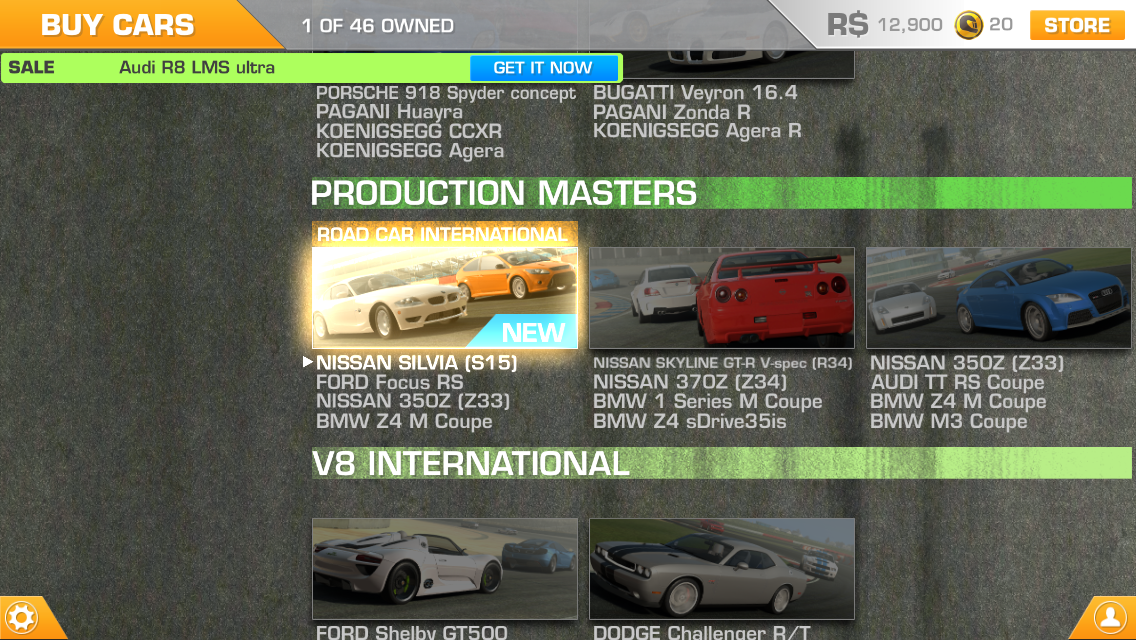
All the Stats!!
When initially designing menus for Project 2, I looked at a LOT of RPGs on iOS. A ton. Most of them have terrible menus, but I don’t think it’s from a lack of effort. The overarching issue I found was information overload. Most RPGs have complex systems and the temptation is to show the user everything. Why show JUST the skill tree when you can show the skill tree, items, weapons, quests, system options, and crafting all on the SAME screen?
The problem is this design is for crazy people, by crazy people. That amount of information will drive away all but the most hardcore RPG fans. Honestly, I was also guilty of this sort of temptation early in our current project’s development cycle. Here is the early crafting menu:

All the Info, All Wrong
Although this menu isn’t as horrendous as some of my other creations, it’s still pretty bad. There’s too much text, too many data fields, and too much information to sort. We actually used this menu system for our first 9 months of development. Then, one sad, cold morning, I admitted defeat and began redesigning the entire menu system. Primarily, I decided to start over because the menus were overloaded. Even worse, I decided...
Your Menus are Ugly
Our menus were ugly. It was painful to admit, but it was true. Our menus just weren’t working so I went back to the drawing board and looked at a lot of other designs. The ones I liked were 3 things: functional, simple, and beautiful. This last characteristic is crucial and overlooked a lot of the time. More importantly, the best menu's beauty resonates with the overall design of the game. Although it wasn’t the main inspiration for my redesign, a great example of this integration is the menu system in Real Racing 3:
Beautiful Design Integrated Seamlessly with Gameplay
Primary menu navigation in Real Racing 3 is swiping up and down. Sub menus are accessed via hot corners (buttons) and the entire design pans smartly over an asphalt texture. A lot of information is presented, but never all at once. On screen elements are large and filled with “beauty shots” of cars. Most importantly, they remind you why you’re playing (great looking cars) and funnel you quickly towards the gameplay.
After several redesigns, the new crafting menu in Project 2 looks like this:

The New Crafting Screen! Now with Less Ugly!
The redesigned menu fits with the gothic art nouveau theme found in the rest of the game. Navigation is handled either by swiping the bottom toolbar or tapping on the character/elements in scene. Statistics are found on cards like this:

The New Crafting Screen: Craft Harder
Elements are nearly full screen, with large, easy to understand information panels. Swiping left and right is similar to the cover flow mechanic seen everywhere in iOS. Most importantly, the design elements fit perfectly with the rest of the game. I no longer feel like “Oh now I’m in menu land”. Flawless victory right? Not quite...
Never Go Half Circle. Only Full Circle.
After nearly 7 years in game development, I’ve learned a hard lesson: Nothing you make is precious. It will be redesigned, trashed, exploded, and kicked to the curb. Right before your project becomes Cat Hospital 3! Kidding about the last part, although that’s always a possibility as well if you aren't independent.
Iterate on the design. Don’t ever be afraid to start over. That button you just made? It can probably be better. That awesome layout? It will change anyway, so go ahead and mentally prepare for that. There is no such thing as a perfect menu, but staying flexible will get you closer to that goal. Putting your design in a little glass box where it can’t be disturbed isn't good for game design. Sometimes, a fresh start is the only way to go. Or like 6 fresh starts.

