Recently, The Smithsonian American Art museum unveiled the winners of a 2012 exhibition that will display videogame art. Out of the 240 nominees, 80 were chosen, and, for the most part (uh....I'm looking at you Battle for Middle Earth II) the choices were sound. Because videogame art seems to be getting a lot of press lately, I thought it would be a great time to discuss the art style for our forthcoming game.
Before starting our project, I thought a lot about how our game should look. We knew it was going to be 2D and I knew that I wanted it to have retro inspired look. However, with Texel's engine, we could do a lot more than simply draw sprites or tiles (as I mentioned in one of our earlier posts), so I also knew that I wanted to incorporate some more modern aspects (like particle effects). The final piece of the puzzle was the fact that the entire game world would be one, large single canvas.
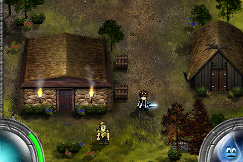
I quickly came to the conclusion that the world should be a highly rendered, painterly environment. With the ability to work on such a large canvas, and no need for repetition, this was a natural choice. Next, I needed to determine the look of the painting. The past few games I've worked on focused more on layer styles in Photoshop, mixed with clean design and occasional cartoon exaggeration. I love this sort of style, but I knew for our game I wanted to try something different, so I opted for a super saturated, detailed oriented look. Also, I made sure to paint from a predetermined palette for each world area, so all of the colors would feel unified. Working in this way has been really enjoyable, and I've loved trying to pack as much detail into every screen as I can.
Once my first area (a beach and a forest) were complete, I began to think about how the characters in the game should be portrayed. My initial impulse was to paint them in the same style as the background, but this yielded terrible results. The main issue was that the characters meshed too much with their surrounding environment, and the whole thing started to feel muddy. Without the ability to easily tell environment from character, I worried the gameplay would suffer.
At this point, I started thinking about past games I've played, in particular The Secret of Mana (which can be found in the gallery at the top of this post). This Super Nintendo classic used outlines around all of its character sprites to differentiate them from the world. As a test, I took my test character, drew a hard black outline around him and placed him on top of my world canvas. The effect was a success, as an easy distinction between the character and the world became apparent. The only remaining issue was that the highly painted character looked out of place with a black outline, which was more reminiscent of classic games (try this site out for great examples of old school pixel art). I tried redrawing him with a more retro inspired flavor and found it not only unified him with the black outline, but the different style helped him stand out from the world even more.
As time wears on and I draw more characters for the game, and look at my completed environments, I feel that I have developed an art style that is beautiful without intruding on gameplay. Because in the end, the game's art style should compliment the game design. After all, that's what makes a video"game" fun, and video"art" something you were forced to talk about in your college art history class.
-Blog-
A Link to Some Perspective
For many, Nintendo's "The Legend of Zelda: A Link to the Past" is a touchstone for what a great action RPG (role playing game) should be. A true classic, it has great puzzles, memorable characters, satisfying (even today) artwork, and a great sense of adventure. Because our current title is also an action RPG, it's only natural that we've spent a lot of time looking at A Link to the Past, both for troubleshooting our own game and to serve as inspiration. Even though we've found many solutions buried within Nintendo's classic; however, one issue continues to prove difficult, and I believe the same dilemma plagued Nintendo's developers 20 years ago. This issue is the game world's perspective.
Anyone who has taken an art class probably remembers the simple exercise of learning two point or one point perspective: take out a drawing pad, draw some lines with a ruler from a vanishing point, then create buildings/hallways/chairs/boxes/etc with convincing depth. It's a fun little lesson in how our brains perceive depth.
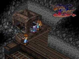
Isometric projection is another kind of perspective. A useful way to represent 3D objects in 2D space, it is commonly used in architecture, technical drawings, etc. It was oftentimes seen in classic RPGs, such as Breath of Fire III, Civilization, and others, as a great way to convey depth in a 2D engine.

As such, it would be easy to look at A Link to the Past and decide that it is also an isometric game. An assumption like this would be wrong. There is actually no true perspective in A Link to the Past. At Pixel and Texel, we've come to call it the "Zelda Perspective" and it is the viewpoint for creating our game world.

What is the Zelda perspective? Why were we dumb enough to choose this path for our game? Questions! Simply put, the Zelda perspective an illusion of truth for the sake of gameplay. Most things in A Link to the Past seem correct. But analyze practically any game screen and the perspective starts to break down into a weird fish-eye lens. The viewer is allowed to see the front, side, AND back of houses. Doorways are presented from the front, side, and top all on the same screen. Certain objects are top down. Others are from the side. Truly, the world of A Link to the Past is a crazy place.
So, on to the second question, which is why we would be dumb enough to create our game with such a wacky perspective? The answer is simple: gameplay. A Link to the Past was created with fun as it's only real utility and we realized that fun gameplay was all that really mattered to us as well. In order for the game world to truly fit in any situation, almost every kind of perspective needs to work. Rooms need doors on all sides that are visible to the player, houses must have the front and roof visible at the same time, and crates must be seen only from top down. The list goes on and on. All of these mechanics are necessary for our game to be fun, but don't make sense from a real world perspective.
The real difficulty in the Zelda Perspective is creating a feeling of truth as the player interacts with the world. This balance can only be described as certain locations feeling "right". There is a continual struggle between whether objects are viewed in perspective or top down, as well as how they are oriented. As development continues, I believe the key to this balance is to never have to many opposing perspectives in close proximity. An open doorway that faces up should not reside to close to several tables that are in perspective facing down. As long as all objects have perspectives that are balanced (perspective vs top down, left vs right, etc) scenes always feel true and "right".
Virtual D-Bad (Pun!) - How Virtual D-Pads Ruin iPhone Games
NO VIRTUAL D-PAD. This was the phrase that rattled around in my brain as we began designing our new game. Lots of iPhone games make use of this dreaded control scheme and I've yet to see it work well in any game. From Street Fighter IV to FIFA, developers freaking LOVE the virtual d-pad. Even more frustrating is the fact that many games, such as the two series I mentioned before, have solid core gameplay systems but are ruined by this strange design decision.
Some game designs simply aren't meant for the iPhone. The iPhone has a touch screen, not a gamepad (surprise!), so games requiring lots of tactile feedback just don't work on the device. 97 hit combos, strafing head shots, and precise platforming are several gameplay mechanics that, when paired with a virtual d-pad, can become an iPhone chucking frustration.
Other games, such as Mirror's Edge on the iPhone, treat the device as a new, exciting way to create a similar gameplay experience to their console brethren, without the need to emulate it 100 percent. EA's game uses a clever swiping control screen that proves a really satisfying way to move the character around. By making use of an input method that iPhone users already understand, the game's control scheme feels totally natural. Winning!
As we began assembling our iPhone game, Texel and I were determined to avoid the virtual d-pad. So far our "no d-pad" mentality has worked out very well. The user simply taps where the character should move, double taps for attacks/interactions, and has use of two HUD buttons for inventory/saving/options. Simplicity. It's why we all bought an iPhone in the first place.

First screenshots and some thoughts from Pixel....
First, I think an introduction is in order. I am half of the game studio Pixel and Texel, more specifically the Pixel half, and I'll be sharing my thoughts, screenshots, and progress as we develop our new action RPG for the iPhone! My real name is obviously not Pixel (it's Andrew), but I think the name is indicative of what I've had on the brain lately. As we work on our new game, I've had to come to grips with creating a visual style that balances nostalgia with our modern game engine. Here's a first peek at some screenshots taken from our current build:


I'm so excited to share these first images! It's been an interesting process figuring out the style for our game. As our studio began thinking about the kind of title we'd like to develop, we realized we had a deep love for classic action/adventure/RPG games. Titles like The Legend of Zelda: A Link to the Past and The Secret of Mana live on in many gamer's minds as fantastic games. We decided to take our love of this genre and create something new for the iPhone.
One aspect of these classic games that always bothered me was repetition. Before I understood sprite, tiles, and the technical limitations of older game consoles, I constantly pondered the "sameness" of game worlds. I hated how every tree in the forest looked the same and how this rock looked just like the last fifty rocks I saw. Some action RPGs on the iPhone still use the tile convention for game creation, and, frankly, I think the look is too stale for the modern era.
Avoiding this stagnation became one of the most important parts of our design as Texel began creating his engine. In the end, we were able to treat the entire game world almost as a living painting, where I'm given a giant canvas and an almost infinite number of object types I can place. This sort of freedom has been immensely satisfying, because I can avoid the dreaded "tile" look and have the sort of variety in the world that makes it feel like a living and breathing place.
I love 2D pixel art. From Metal Slug to Street Fighter II, some of the most beautiful things I've ever witnessed on a game screen are loving animated sprites. As development on our game continued, I felt like I wanted to convey this nostalgia in our game world. My solution was that all characters should be rendered in a classic pixel style. I first worried that sprites with a hard black outline would seem out of place in a carefully painted world, but was pleasantly surprised when I finished the first character. The difference in style really helps the characters stand out against the background! As development goes on, I'll share some tricks/thoughts I've had as I create these little guys. Pixel art is really difficult but very satisfying!
