For many, Nintendo's "The Legend of Zelda: A Link to the Past" is a touchstone for what a great action RPG (role playing game) should be. A true classic, it has great puzzles, memorable characters, satisfying (even today) artwork, and a great sense of adventure. Because our current title is also an action RPG, it's only natural that we've spent a lot of time looking at A Link to the Past, both for troubleshooting our own game and to serve as inspiration. Even though we've found many solutions buried within Nintendo's classic; however, one issue continues to prove difficult, and I believe the same dilemma plagued Nintendo's developers 20 years ago. This issue is the game world's perspective.
Anyone who has taken an art class probably remembers the simple exercise of learning two point or one point perspective: take out a drawing pad, draw some lines with a ruler from a vanishing point, then create buildings/hallways/chairs/boxes/etc with convincing depth. It's a fun little lesson in how our brains perceive depth.
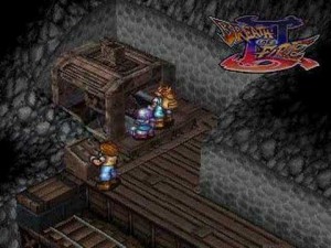
Isometric projection is another kind of perspective. A useful way to represent 3D objects in 2D space, it is commonly used in architecture, technical drawings, etc. It was oftentimes seen in classic RPGs, such as Breath of Fire III, Civilization, and others, as a great way to convey depth in a 2D engine.

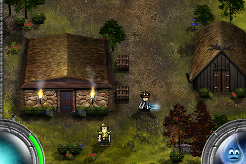
As such, it would be easy to look at A Link to the Past and decide that it is also an isometric game. An assumption like this would be wrong. There is actually no true perspective in A Link to the Past. At Pixel and Texel, we've come to call it the "Zelda Perspective" and it is the viewpoint for creating our game world.

What is the Zelda perspective? Why were we dumb enough to choose this path for our game? Questions! Simply put, the Zelda perspective an illusion of truth for the sake of gameplay. Most things in A Link to the Past seem correct. But analyze practically any game screen and the perspective starts to break down into a weird fish-eye lens. The viewer is allowed to see the front, side, AND back of houses. Doorways are presented from the front, side, and top all on the same screen. Certain objects are top down. Others are from the side. Truly, the world of A Link to the Past is a crazy place.
So, on to the second question, which is why we would be dumb enough to create our game with such a wacky perspective? The answer is simple: gameplay. A Link to the Past was created with fun as it's only real utility and we realized that fun gameplay was all that really mattered to us as well. In order for the game world to truly fit in any situation, almost every kind of perspective needs to work. Rooms need doors on all sides that are visible to the player, houses must have the front and roof visible at the same time, and crates must be seen only from top down. The list goes on and on. All of these mechanics are necessary for our game to be fun, but don't make sense from a real world perspective.
The real difficulty in the Zelda Perspective is creating a feeling of truth as the player interacts with the world. This balance can only be described as certain locations feeling "right". There is a continual struggle between whether objects are viewed in perspective or top down, as well as how they are oriented. As development continues, I believe the key to this balance is to never have to many opposing perspectives in close proximity. An open doorway that faces up should not reside to close to several tables that are in perspective facing down. As long as all objects have perspectives that are balanced (perspective vs top down, left vs right, etc) scenes always feel true and "right".


