-Blog-

Developers, Developers, Developers

Hey there everyone. So Pixel and Texel has been expanding a lot in the last year. In addition to bring on some brand new team members, we are in the process of moving to a beautiful new office space in downtown Dallas. We'll miss our current office in Deep Ellum, but we are definitely looking forward to the extra room and new view :-)

More importantly, we are looking to add additional developers to our close knit team of code misfits. So are you, yes YOU, that person? Do you have a fiery passion for beautifully designed mobile apps and websites? If so, we'd love to talk! Send your CV to jobs@pixel-n-texel.com

We'll talk to you soon!

Studio Update

It's been a long while since the last update, so we thought it was time to post some news. Pixel and Texel has been humming along fine, although we've diversified our studio's focus. Here's a the short version:

  • Fara sold okay, but not enough for Texel to buy that Ferrari he's had his eye on. Selling games is hard everyone!
  • We started taking on a lot of contract work. Mostly app development for things like pharmacies, productivity products, database work. It sounds a little dry, but we've really enjoyed shifting some of our focus to non-gaming related work. It's nice to design a series of menus where pushing a button takes you to the next thing. As a plus, no one complains that the button you made created a stat imbalance and now their character is improperly leveled and now their life is over and how could you guys do this.
  • For the last year, we've done a lot of work creating and selling on the Unity Asset Store. It's been pretty awesome for us, because we get to work on a lot of the parts of game development that we enjoy, without a lot of the headaches. You should check out our stuff!
  • Our elusive game "Project 2" was developed until it was about 80 percent complete. We may continue work on it, but for now we've shelved it. 
  • We hired 2 awesome dudes that have greatly enhanced our team, so we are now a group and not a duo! This also means our daily volleyball matches are way less awkward. 


The One About Menus

Menu design. Two words that make a lot of game developers shudder. That menu that you designed yesterday will change today. It will change tomorrow. A year from now, your lovely menu will look like a monstrous hybrid of compromise, feature creep and “I forgot about that button”. Almost everyone I know in game development has felt the pain of menu design. Alternately, a smartly designed menu system can feel like a bigger win than even the most polished gameplay mechanic.

Design for the Platform: What iOS?

Designing for the platform seems like a simple idea, but I think it’s one that’s woefully underutilized. A menu that really “pops” on the PS3 or that seems “really smart” on 3DS gets redesigned for iOS and it’s terrible. Most good iOS games take advantage of the system menu design already inherent on the platform. Cover flow, pinch to zoom, and drag to pan work because they are proven mechanics that already exist in iOS. 

photo.PNG

I almost NEVER see good iOS developers reinvent the wheel when it comes to menu navigation mechanics. But I think that’s okay. Some of the best menu design comes from smartly building of off Apple’s conventions. Task is a great example of this (I realize Task is very similar to Clear, but I think Task is a little bit better). I can’t believe how well they use pinch navigation to create and manage events. Plus the layout is simple! 

Task in Action! (Photo from http://thenextweb.com)

Task in Action! (Photo from http://thenextweb.com)

All the Stats!!

When initially designing menus for Project 2, I looked at a LOT of RPGs on iOS. A ton. Most of them have terrible menus, but I don’t think it’s from a lack of effort. The overarching issue I found was information overload. Most RPGs have complex systems and the temptation is to show the user everything. Why show JUST the skill tree when you can show the skill tree, items, weapons, quests, system options, and crafting all on the SAME screen?

The problem is this design is for crazy people, by crazy people. That amount of information will drive away all but the most hardcore RPG fans. Honestly, I was also guilty of this sort of temptation early in our current project’s development cycle. Here is the early crafting menu:

All the Info, All Wrong

All the Info, All Wrong

Although this menu isn’t as horrendous as some of my other creations, it’s still pretty bad. There’s too much text, too many data fields, and too much information to sort. We actually used this menu system for our first 9 months of development. Then, one sad, cold morning, I admitted defeat and began redesigning the entire menu system. Primarily, I decided to start over because the menus were overloaded. Even worse, I decided...

Your Menus are Ugly

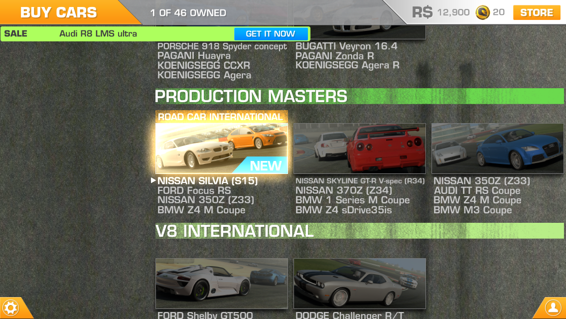
Our menus were ugly. It was painful to admit, but it was true. Our menus just weren’t working so I went back to the drawing board and looked at a lot of other designs. The ones I liked were 3 things: functional, simple, and beautiful. This last characteristic is crucial and overlooked a lot of the time. More importantly, the best menu's beauty resonates with the overall design of the game. Although it wasn’t the main inspiration for my redesign, a great example of this integration is the menu system in Real Racing 3:

Beautiful Design Integrated Seamlessly with Gameplay

Beautiful Design Integrated Seamlessly with Gameplay

Primary menu navigation in Real Racing 3 is swiping up and down. Sub menus are accessed via hot corners (buttons) and the entire design pans smartly over an asphalt texture. A lot of information is presented, but never all at once. On screen elements are large and filled with “beauty shots” of cars. Most importantly, they remind you why you’re playing (great looking cars) and funnel you quickly towards the gameplay.

After several redesigns, the new crafting menu in Project 2 looks like this:

The New Crafting Screen! Now with Less Ugly!

The New Crafting Screen! Now with Less Ugly!

The redesigned menu fits with the gothic art nouveau theme found in the rest of the game. Navigation is handled either by swiping the bottom toolbar or tapping on the character/elements in scene. Statistics are found on cards like this:

The New Crafting Screen: Craft Harder

The New Crafting Screen: Craft Harder

Elements are nearly full screen, with large, easy to understand information panels. Swiping left and right is similar to the cover flow mechanic seen everywhere in iOS. Most importantly, the design elements fit perfectly with the rest of the game. I no longer feel like “Oh now I’m in menu land”. Flawless victory right? Not quite...

Never Go Half Circle. Only Full Circle.

After nearly 7 years in game development, I’ve learned a hard lesson: Nothing you make is precious. It will be redesigned, trashed, exploded, and kicked to the curb. Right before your project becomes Cat Hospital 3! Kidding about the last part, although that’s always a possibility as well if you aren't independent. 

Iterate on the design. Don’t ever be afraid to start over. That button you just made? It can probably be better. That awesome layout? It will change anyway, so go ahead and mentally prepare for that. There is no such thing as a perfect menu, but staying flexible will get you closer to that goal. Putting your design in a little glass box where it can’t be disturbed isn't good for game design. Sometimes, a fresh start is the only way to go. Or like 6 fresh starts.

Our Favorite Things in 2012

Happy New Year! 2012 was a great year at Pixel and Texel. We spent most of it developing our new title, as well as finishing support for Fara and a few other projects. Any year that we get to spend our days developing games and working on new things is a success. Sometimes it's easy to focus on the future (what are going to make next?!, what should we do?!, etc!), but we are incredibly lucky guys to just be making games TODAY.

Okay, now that we've got all that philosphical junk out of the way, on to some fun lists! Everyone seems to make these at the end of the year, and we always enjoy reading/discussing/disagreeing with them. So, without further ado, here are things that we loved in 2012!

**Note, Andrew's list are things that actually came out in 2012. Brett's are just things he liked, because, well, he tends to wait until holidays and birthdays for his games, so he is usually a year behind. Also, he is grumpy and likes what he likes, dangit. Regardless of the year!**


Andrew's List:

Games: 

Sound Shapes (Vita) -Brilliant platforming design. THE reason to own a Vita.

The Walking Dead (PS3) -Probably the best story in a game ever. Not sure how much gameplay is really there, but I didn't care.

Persona 4 Golden (Vita) -Completely addicting, strange and engrossing. I ended up caring more about the daily life of Inaba than actually fighting through dungeons.

Resident Evil Revelations (3DS) -The best Resident Evil game this year (and I actually liked 6!). Tense, gripping survival horror.

True Skate (iOS) -I love this game. It is basically just a sandbox to play in (with a virtual skateboard), but I played it until my fingers cramped. The skateboard just "feels" right.

Music: 

High on Fire - De Vermis Mysteriis -Amazing sludge metal from the best metal band around.

Gemma Hayes - Let It Break -Brave, ethereal songwriting from Ireland. 

Tanlines - Mixed Emotions -This album was sorta trendy. But I really like it a lot. Synthesizers, beat heavy, great lyrics.

Hard Girls - Isn't It Worse -The best punk album of the year. Passionate and real. I cannot stress enough how good this is.

Sharks - No Gods -The Clash meets something newer. Absolutely great songs.

Movies:

Moonrise Kingdom -Probably the best Wes Anderson film in a long time. A great intersection of drama, comedy and surrealism.

The Dark Knight Rises -A fitting end to the trilogy. Some people didn't like it. These people also don't like good things.

The Cabin in the Woods -Incredible horror/comedy/parody. The last 15 minutes are amazing.

Bernie -Jack Black is so, so good in this one. It also nails the feeling of small town Texas.

Jeff Who Lives at Home -A beautiful, life affirming movie. Jason Segal's best.


Brett's List: 

Games

Skyrim (Xbox 360) *You don't finish Skyrim (But I killed Alduin)

Journey (PS3) *Beat this 

Deus Ex: Human Revolution (Xbox 360) *Beat this

Sound Shapes (Vita)

Letterpress (iOS)

Music

*Warning!* There is some dubstep, but the list is rather eclectic (Brett's Hypemachine Profile):

http://hypem.com/brett_estabrook

Movies 

Dark Knight Rises

Django Unchained

Looper

Avengers

Moonrise Kingdom

Anime I Got Into:

Steins;Gate 

Ghost in the Shell

Darker than Black 

Black Lagoon

Phantom: Requiem for the Phantom

Cowboy Bebop


Project 2 Update! - More Info and Screenshots

Hello up there! We've been deep in the development cave for the last few months working on Project 2 and thought it might be nice to share some new info/screenshots. The game is really coming together and we've finished some nice features so far:


-Fast paced, arena style combat. Use twitch gameplay skills to survive the horde, combo enemies, and discover new items.

-A deep crafting system for new weapons, armor, potions, and enchantments. Customize your character with gear for a fresh new look and improved stats.

-Level up and distribute skill points to build a character that suits your play style.

-Lots of meticulously painted 2D artwork.

-More awesome stuff that we can't talk about yet!


We are still toiling away on some super cool stuff (like multiplayer!), so we'll share more on that soon. It's crazy to think how far this game has come since we started it in Dec 2011. Time flies! So thanks for reading and we'll drop another update soon! (In the meantime, check out some new gameplay screens below) 


Project2Screen.png
Project2Screen2.png
Project2Screen3.png